Redesigning for Efficiency: Our Journey to a Better User Interface
In This blog
Our journey to improve PractiTest’s UI is well underway. All the changes we’ve made so far were around putting our users at the center, aiming to provide a better experience and increase your work efficiency. The most recent change was releasing a new layout for the Test Sets & Runs module, and with more changes yet to come, we want to share the ideas behind the recent updates and their benefits.
The Need for Change
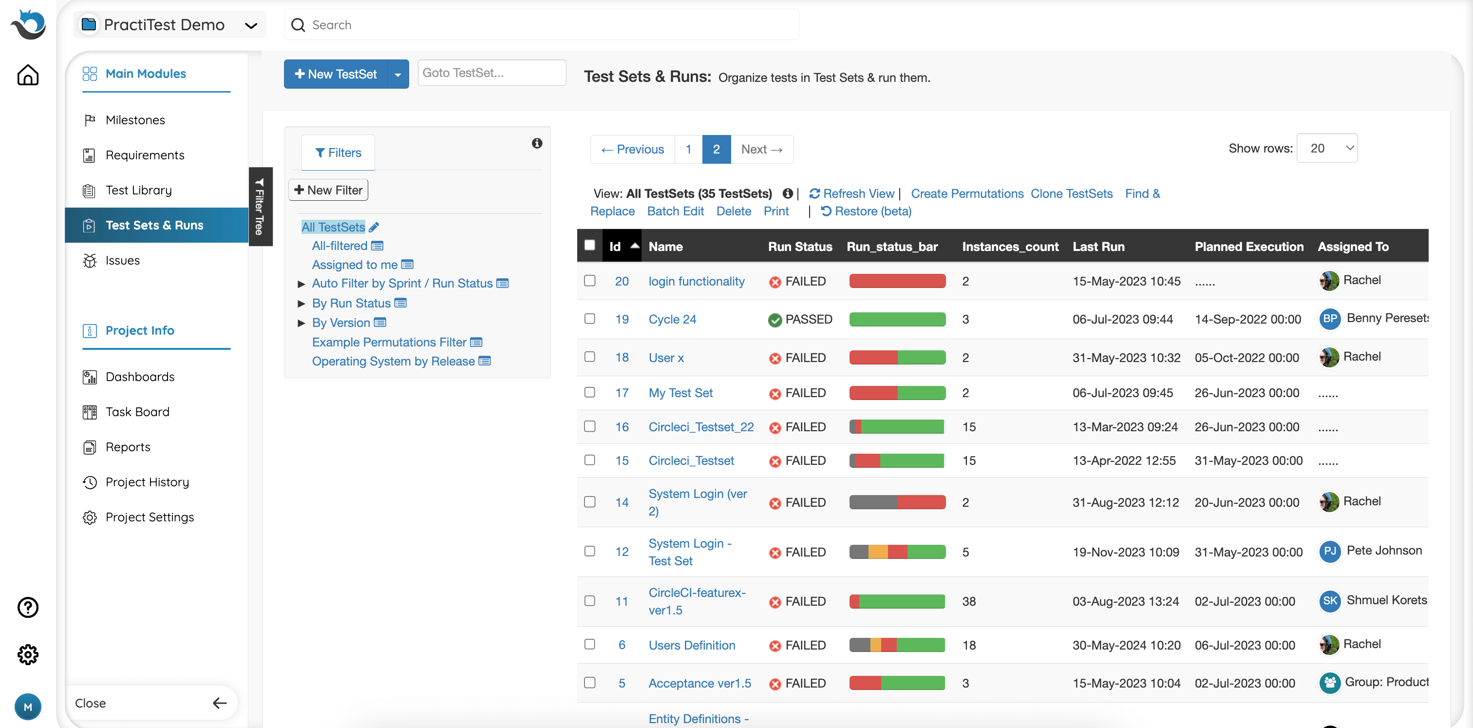
Let’s focus on the recent upgrade to the Test Sets & Runs module. It was driven by the need to address several key user challenges that the new layout aims to resolve:
-
Data Management: Users needed a more efficient way to manage their testing data quickly. We aimed to improve the layout to offer enhanced capabilities for slicing and dicing data according to users’ needs, making it easier and more effective to manage test sets.
-
Findability: In large and complex projects with extensive testing data, finding the relevant information can be time-consuming. In our new layout, we sought to help users locate what they need more quickly and enhance their efficiency.
-
Screen Real Estate: Some users felt they didn’t have enough space to view and manage their testing data comfortably. In response, we looked for ways to improve the layout and include more data, creating a more spacious and efficient design.
How Do We Solve It?
To address those challenges, we implemented several changes in the Test Sets & Runs module:
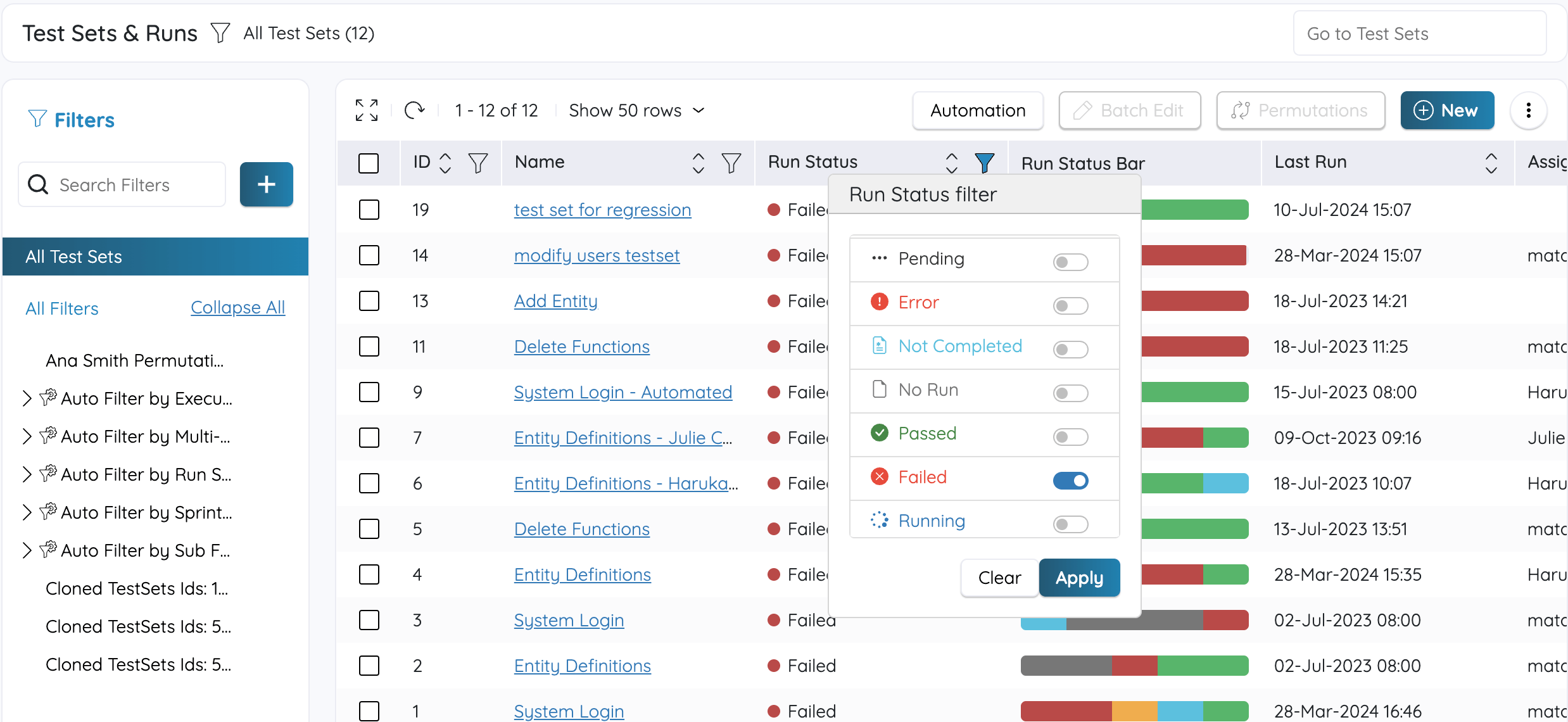
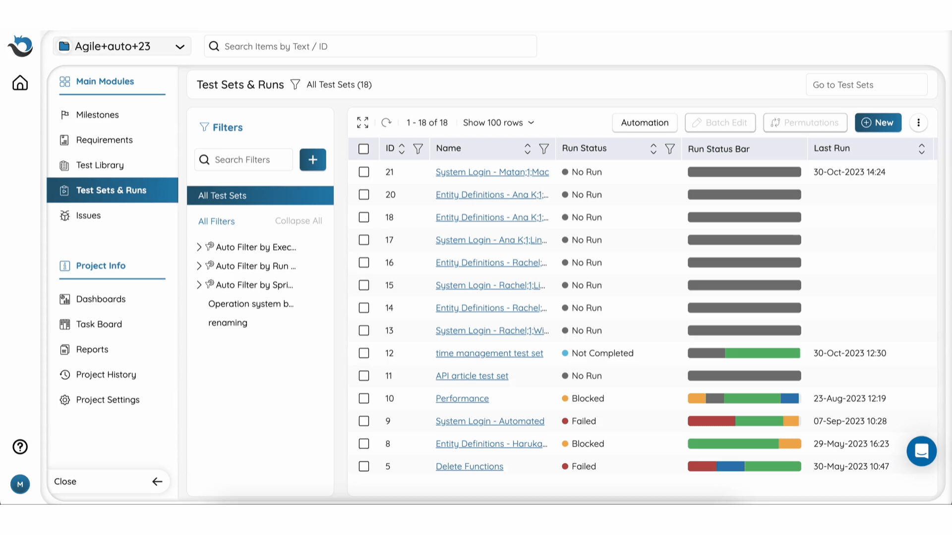
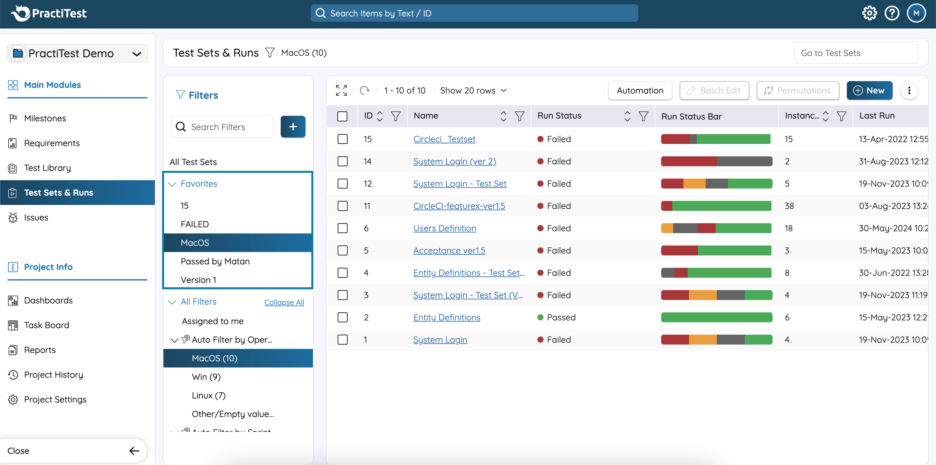
- Advanced Sorting and Filtering: Firstly, the fresh-looking grid layout, including relevant buttons (batch edit, permutations, etc.), is more intuitive and clear, aligning with the instance grid inside each Test Set. To enhance data management further, we added advanced sorting capabilities, allowing you to slice and dice your data more efficiently and arrange it the way that suits you. The new layout provides customizable columns and improved filtering options, making it easier for users to manage their test sets according to their specific needs.
-
Enhanced Search Functionality: To provide better and quicker findability, we enhanced the search functionality and added the ability to search for specific filters. This means users can now find the information they need more quickly, significantly reducing the time spent searching for Test Sets and navigating through data.
-
Expand Grid Button: Regarding screen real estate, we redesigned the interface to be more spacious. We’ve added a new ‘Expand Grid’ button that enlarges the grid to fullscreen, providing more room for testing data. This change allows users to view and manage their information more comfortably and effectively.
New UI Updates are Now Live!
As we continue to improve PractiTest, we’re excited to introduce the latest changes that are now live. Our goal is to keep enhancing the user experience, making the platform even more intuitive and efficient. Here’s what’s new:
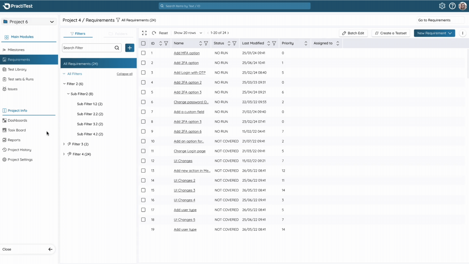
New Layout for Requirements, Test Library, and Issues
New layout for the Requirements, Test Library, and Issues Modules. This new layout is similar to the updated Test Sets & Runs module, featuring the same design and enhanced capabilities such as advanced sorting, improved filtering, search for specific filters, and the ability to expand the grid to full screen. The new layouts also load faster than the existing layouts and provide smoother transitions between screens. This ensure consistency and alignment across all modules, providing a seamless experience throughout the platform.
Favorites Filters
As part of the new layouts, we also released a feature called “Favorites Filters.” This enhancement adds a new section to the filter tree named “Favorites,” allowing each user to pin up to 15 preferred filters at the top, based on their own needs and tasks. This feature is designed to help users save time and quickly access the filters they frequently use, such as important project-specific filters or those needed for regular reporting tasks.
New Top Bar
In addition to the new modules layout, we removed the leftmost panel that includes the account settings button, the help button, and the user avatar, and relocate them to the top of the screen. The header also received a new color to distinguish it from the rest of the platform. This change saves valuable screen space, allowing you to focus more on your testing data.
Those updates are automatically available to you by default. For those who wish to go back to the old UI, click on your avatar and choose ‘Switch to classic UI - Index Grids’. Reverting to the old UI is available only for a few weeks. Afterward, all users will transition to the new UI without the option to revert.
Conclusion
We truly believe the recent and upcoming changes will significantly enhance your productivity and satisfaction with PractiTest. We look forward to hearing your thoughts, as user feedback has been instrumental in guiding our redesign process. For instance, many of you highlighted the need for better use of screen real estate to display more testing data, which led us to implement the Expand Grid button and other layout improvements.
We encourage you to share your experiences and suggestions with us. Your input is highly important and helps us create a better platform for everyone.
Thank you for being an essential part of PractiTest’s growth.